
Stockholm Music Week marks the beginning of a new long-term initiative, one that positions the city not only as a host, but as an active contributor to the future of global music culture. As part of this launch, WDW has been working closely with the founder Johan Seidefors to develop the concept and visual identity for Stockholm Music Week.
The visual identity for Stockholm Music Week 2026 positions Stockholm as a global epicenter of music - a place where ideas originate, converge and expand outward. Sweden’s long-standing role as one of the world’s leading exporters of popular music forms the contextual foundation, bringing together musical heritage, innovation, technology and contemporary cultural influence.
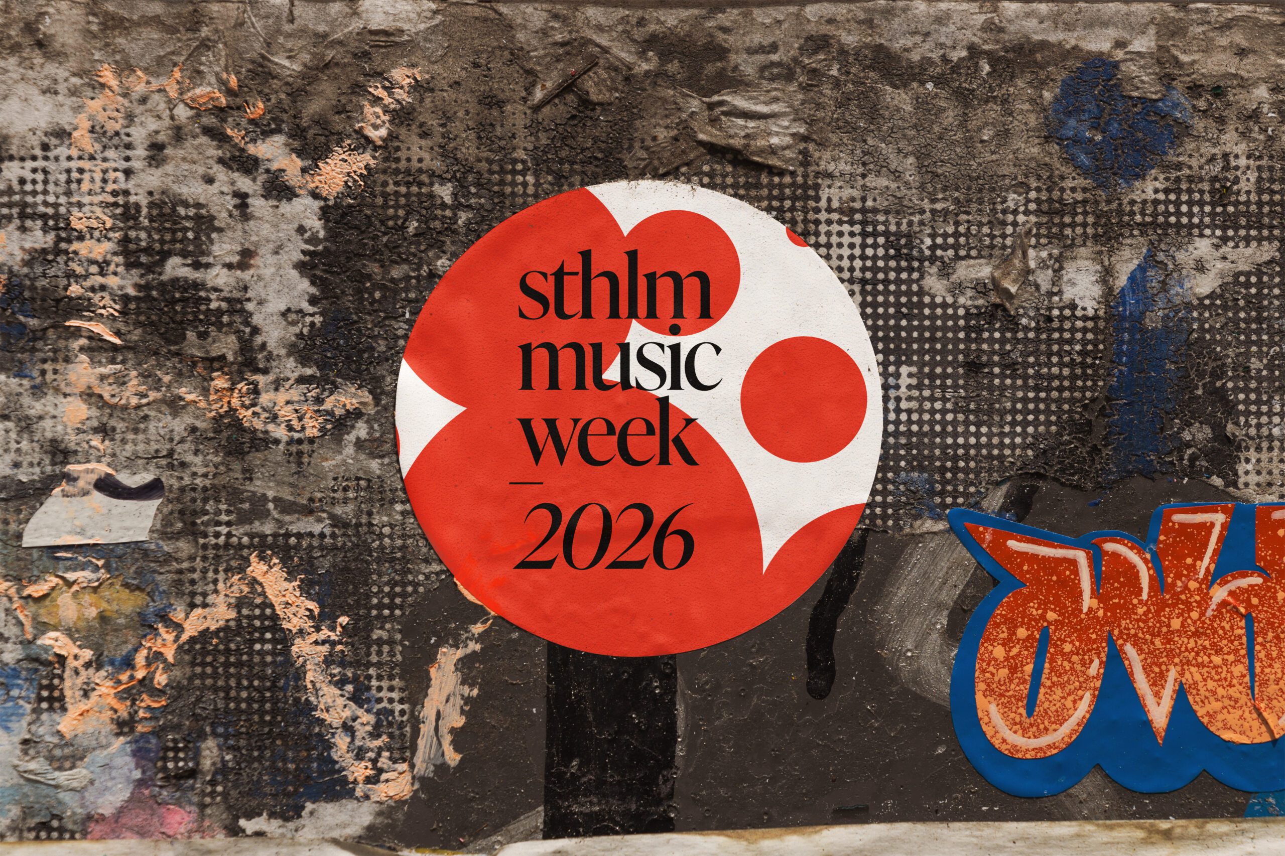
The concept is built around the circle as both a visual and structural principle. The circle represents origin, rhythm and presence - the first beat, the individual artist and Stockholm as a central point within the global music ecosystem. From this point, the system expands. Multiple circles form constellations and grids, visualising how individual creative forces connect to create a shared, collective rhythm. Music is presented not as isolated moments but as an interconnected network of people, places and ideas.
This logic is translated into a flexible and modular design system. Intersecting circles generate dynamic patterns that shift in scale, composition and density depending on context and application. The system is intentionally adaptive, allowing the identity to respond across formats, platforms and content types while maintaining clarity and recognisability. Collaboration, exchange and movement are embedded directly into the structure, reinforcing Stockholm Music Week’s role as a catalyst within the global music industry.
The logotype is designed as a variable element rather than a fixed mark. Its form adapts within the circular system, enabling variation without compromising coherence. This approach reflects the nature of music culture itself - constant evolution within a clear framework. Typography is treated with equal intent, balancing precision and character to support both informational and expressive needs across digital and physical touchpoints.
Color plays a functional and communicative role within the identity. A bold, high-contrast palette ensures visibility, energy and contemporary relevance while supporting layered compositions and modular applications. The palette reinforces music as something active and immediate - confident, dynamic and unapologetic.
Together, these elements form a cohesive, scalable and future-oriented visual language. The identity for Stockholm Music Week 2026 is designed not only to represent an event but to articulate Stockholm’s position as a living hub for global music - a place where ideas begin, connect and move forward.