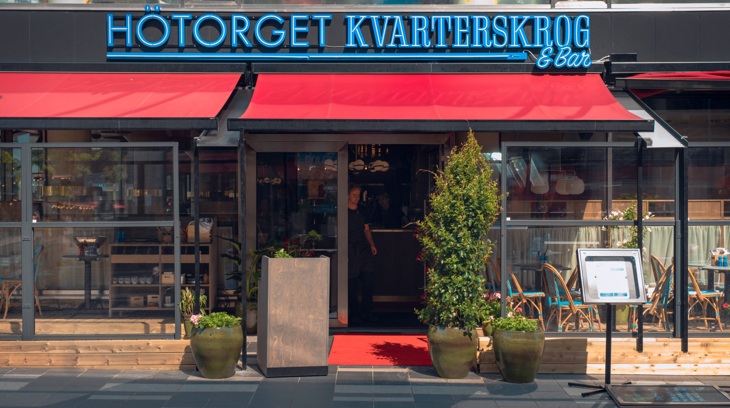
Since the iconic scrapers at Hötorget were built in the 1950s, the area has been a magnetic landmark. A hub for trade, creativity, and new ideas in the capital. Bockholmengruppen got the opportunity to be one of the restaurant-owners to bring Hötorget to life again when rebuilding the area.
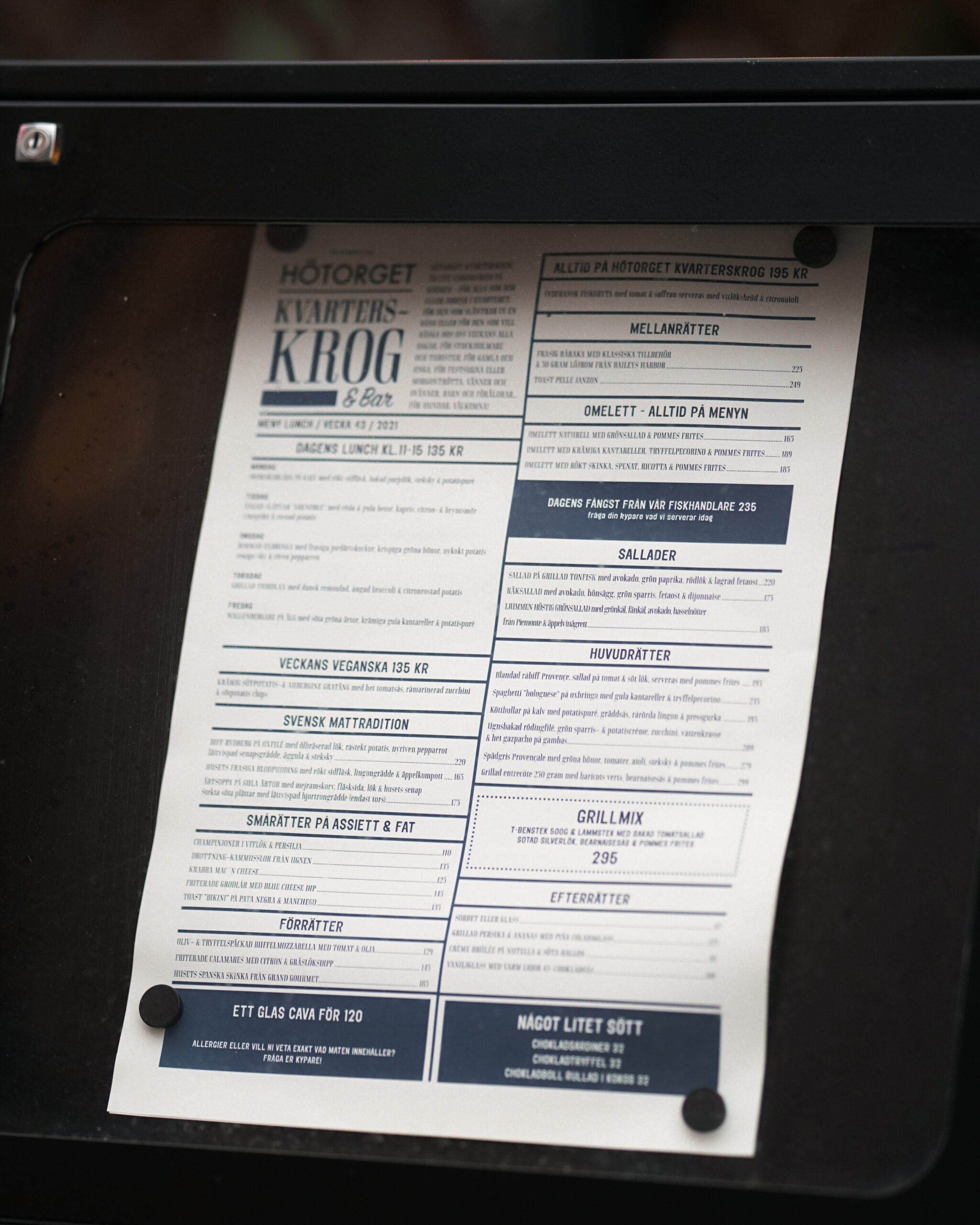
The starting point in the development of the graphic identity and the feeling around Hötorget Kvarterskrog was to embrace all the differences that fits in the restaurant. By mixing a classic "bistro expression" that brings your mind to classic restaurants such a Balthazar in NY with a San Seriff that gives a wink to Hötorgets architecture, it creates a distinctive expression that also meets the functional requirements for the identity.
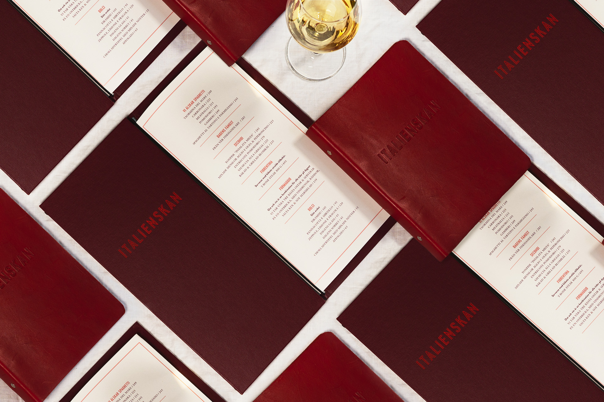
The graphic identity for Italienskan is in red tones and the typography is inspired by classic neon signs. Adjacent to the Italian you will find also the terrace bar Terrazza, here comes the inspiration instead from the Italian Riviera and its sun-bleached tones


