Creativity and attention to detail are Antonio's trademarks and the repertoire is wide. Known for his uncompromising love for the profession, and his constant pursuit of excellence, Antonio Axu has established himself as one of Sweden’s top celebrity hair stylists with constantly over-booked salons in Stockholm. Perhaps it’s the quest for perfection that more than anything else defines Antonio Axu, both as a human being and a hairdresser.
Before coming to us for help with the redesign, an internal process with repositioning the brand had started with the objective to position the brand as more ”artistic” and highlighting Antonio’s edginess and rock’n’roll feeling.
We began, in what would become a year-long process, developing the design for the overall brand as well as for individual products and ranges. First, we made a few but needed updates to the logo and wordmark, cleaning it up and giving it a more contemporary look.
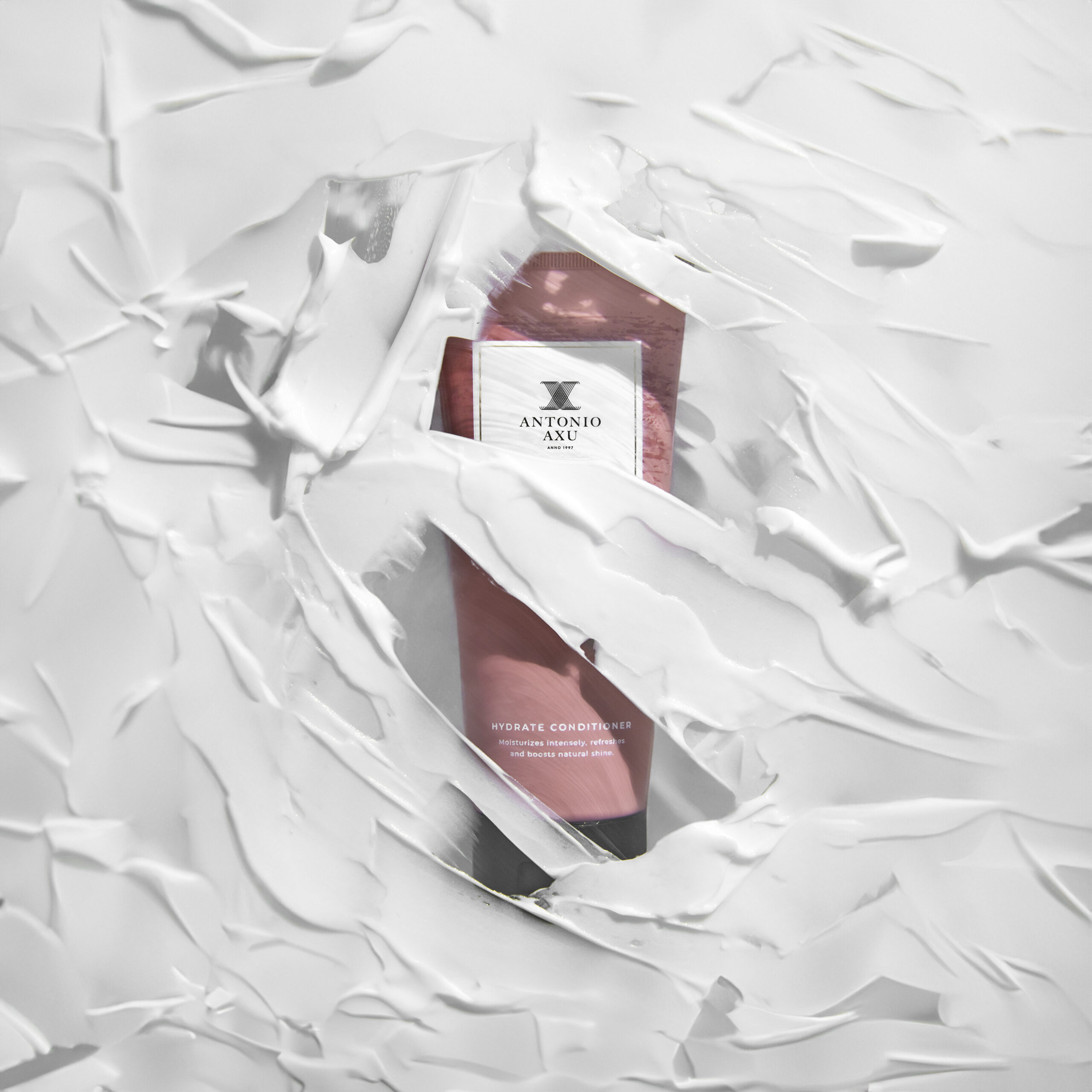
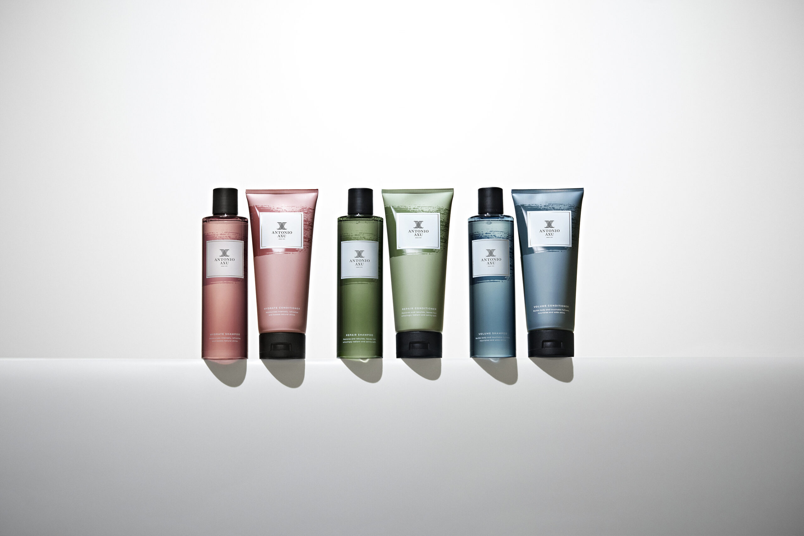
After that our primary focus was the hair care products starting with the three series of shampoo and conditioner. We created a graphic element to enhance the artistic side of the brand, really focusing on making sure it stands out and is perceived as strong and decisive. Our biggest change to the packaging of the hair care series was to work with colored bottles and tubes making sure they're seen as duos but still having a clear common thread in the color scheme.
The color scheme balances the earthy, organic tones of olive green with the cooler, metallic tones of steel blue, while dusty pink adds a touch of softness and femininity. The contrast between the ruggedness of military-inspired colors and the sleekness of rock 'n' roll influences creates a visually interesting and versatile palette.
For the styling series we decided to keep the raw stainless-steel look, a trademark for Antonio's products, but to match it we wanted to work even more with clear bottles for products such as hair mists, oils, etc. giving the whole series a uniform look.
First products available from January 2024.


