7A offers lounges, offices, and meeting rooms in Stockholm city – or in other words, workspaces, and meeting places. Our mission was to clarify 7A's position and brand, create a common thread for their different facilities, and review 7A's design language and communicative expression.
One challenge was that 7A is not one place, but several. Therefore, the brand is not perceived exactly the same on Strandvägen as it is, for example, on Odenplan. So, the question is what parts are common? Parts that are linked to the brand, and not to each respective address.
One thing that defines 7A is their openness, personal approach, and welcoming environment. This is something we focused on both when developing the brand platform and during the creation of the new design language and communication. As most companies on the market have similar offers, messages and expressions, it became quite natural for us to focus on the more emotional qualities in order to make 7A stand out from the crowd.
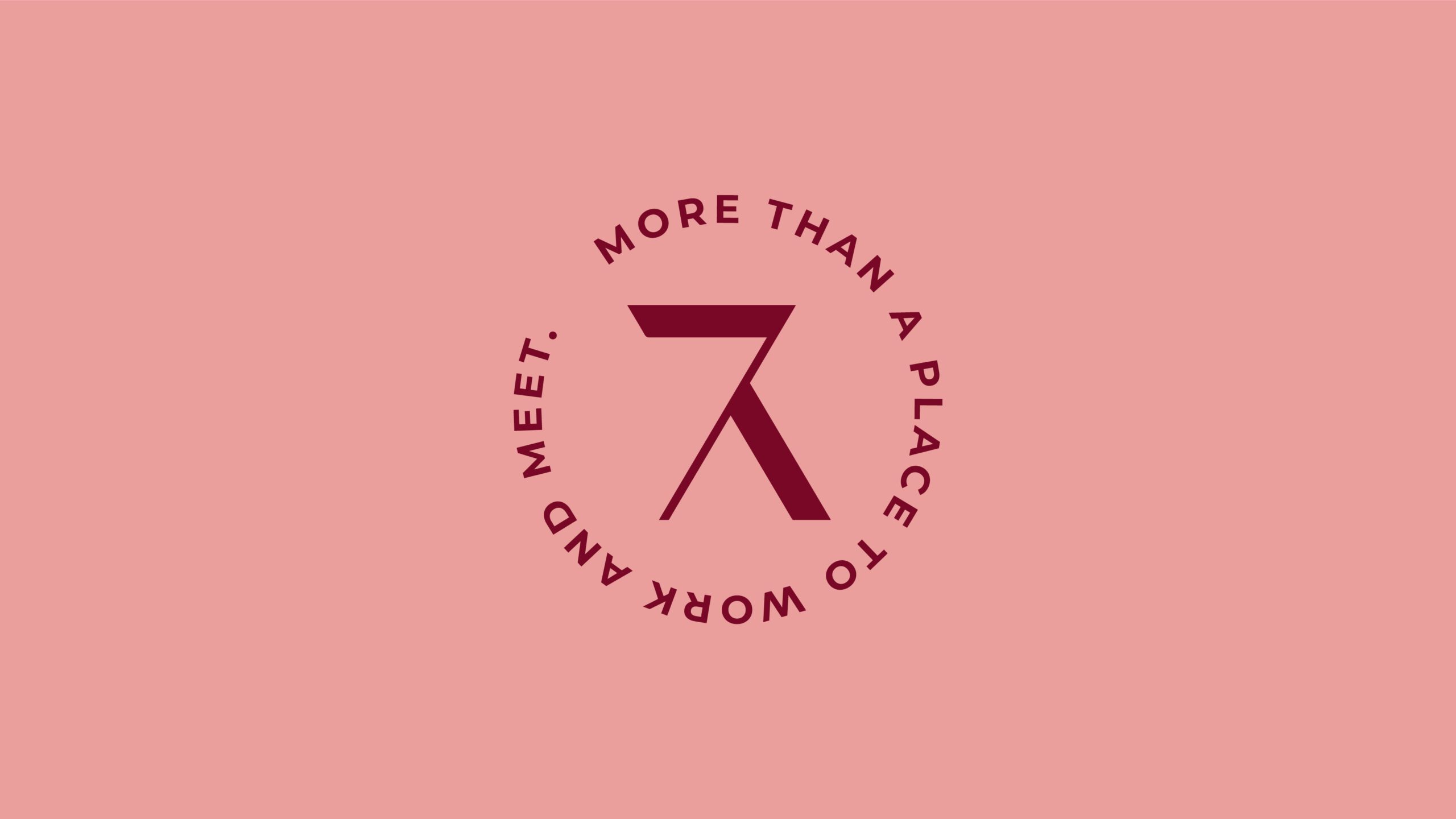
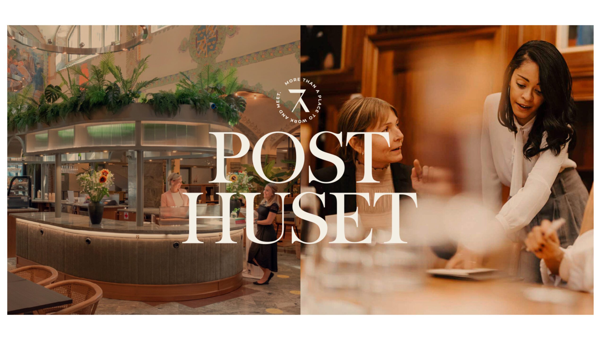
Working on the redesign of 7A, we chose to keep their existing symbol. But to clarify their offer, we decided to frame the symbol with the tagline "More than a place to work and meet." By updating the color palette and giving it brighter colors, we gave the brand some new energy. We also reviewed 7A's imagery to create a warm and welcoming feeling, while ensuring the images were of high quality in both lighting and composition.
Another important part of the work was reviewing the hierarchy in how 7A presents itself and its locations. We developed separate logos for each individual location and let the locations take center stage, with 7A's logo acting more as a guarantee or sender. This has significantly contributed to giving each location its own character while the 7A brand remains strong and recognizable.


